




Volume 199 - Issue 11
How should we interpret hospital infection statistics?
Authors: Allen C Cheng, Emily Woolnough, Leon J Worth and David V Pilcher
Med J Aust 2013; 199 (11): 735-736. || doi: 10.5694/mja13.10703
Published online: 16 December 2013
Published online: 16 December 2013
Infection control data as presented on the MyHospitals website should not be used to rank hospitalsUpdated indicators of safety and quality for the 2011-12 financial year were released earlier this year by the National Health Performance Authority (NHPA) on the MyHospitals website (http://www.myhospitals.gov.au). These detail the reports received by the NHPA on a single outcome measure, Staphylococcus aureus bacteraemia (SAB), and a process measure, compliance with ...
Infection control data as presented on the MyHospitals website should not be used to rank hospitals
Updated indicators of safety and quality for the 2011–12 financial year were released earlier this year by the National Health Performance Authority (NHPA) on the MyHospitals website (http://www.myhospitals.gov.au). These detail the reports received by the NHPA on a single outcome measure, Staphylococcus aureus bacteraemia (SAB), and a process measure, compliance with hand hygiene. The universal reaction in the media was to rank hospitals, implying that low hand hygiene and high bacteraemia incidence reflect poor quality of care.1 Although we support the open publication of this information, we caution against overinterpretation of the results.
For infrequent events such as SAB, random variation plays a large role in determining ranking. This is illustrated by the “performance” of hospitals across the two financial years reported to date. If the risk of infection is the same for all hospitals, then a year in which there is a very high (or low) infection rate would be unusual, and in the following year there would be a tendency for a more “normal” rate. Four of the 10 major hospitals with the highest SAB rates in 2010–11 were not in the top 10 in 2011–12. This is a statistical phenomenon (regression towards the mean) and may not necessarily reflect processes that have been put in place to reduce infection rates, or other changes over time.
More information can be gained from a funnel plot of the MyHospitals data, which graphs infection rate against hospital size for 2011–12 (Box).2 Within the outer dashed lines are the range of infection rates expected to occur in 99.7% of hospitals with the same risk of infection. Where a hospital is outside this range, it is predicted that there is less than a 0.3% chance that the risk is the same as the average of the group.
However, another feature of this funnel plot is that the reported rates from more than 5% of hospitals lie outside the 95% confidence interval (inner dashed lines), and only three of the eight outliers were also outliers in 2010–11. This may suggest “overdispersion”, which is most commonly due to inadequate risk adjustment, where between-hospital variation may be due to unmeasured factors.2 This is evident in the hospitals listed in the NHPA’s “major hospitals, more vulnerable patients” group, which include both small specialty hospitals such as the Peter MacCallum Cancer Centre (that exclusively treats haematology and oncology patients) and large community-based hospitals. Outside of broad stratification by hospital grouping, the NHPA was unable to risk-adjust hospitals more completely.3 Variation in rates between hospitals may also be due to differences in data collection or data quality at individual hospitals, different interpretations of the common national definition, and differences between state and territory reporting systems.4
What should be done with hospitals with consistently higher than expected infection rates? A consistently high rate makes it less likely that this represents a chance finding. The Mid Staffordshire NHS Foundation Trust Inquiry was charged with sorting out a similar problem when the death rate of patients in a hospital trust in the United Kingdom appeared to be higher than normal, leading to accusations of the trust being responsible for hundreds of “excess deaths”.5 It was suggested during the Inquiry that abnormal rates are only a starting point for investigation. Many bodies charged with monitoring health care quality indicators, including the Australian and New Zealand Intensive Care Society Centre for Outcome and Resource Evaluation and, in the UK, Dr Foster Intelligence, have defined processes that are followed whenever a hospital is identified as a statistical outlier. For example, Dr Foster Intelligence suggests asking:
Has the hospital submitted incorrect data or applied different data codes to other hospitals?
Has something extraordinary happened within the time frame (eg, an abnormal run of severely ill patients in a short period of time)?
Does the organisation and its surrounding health care partners work in a different way to others across the country?
Is there a potential issue with quality of care?6
Finally, just because all hospitals have the same infection rate would not necessarily mean that this is acceptable. The goal is to eliminate all preventable infections. Many hospitals have established processes whereby each individual case is reviewed by the infection prevention team and the treating unit to examine preventable factors.
We caution against the natural tendency to rank hospitals and the inference that a hospital’s rank indicates its relative safety and quality of care. Although rankings are conceptually easy to understand, more useful information may be derived from analyses such as funnel plots. From our examination of the reported figures, we conclude that most hospitals are probably equally successful (or unsuccessful) in reducing the incidence of SAB. We should be cautious about overinterpreting the data on a single infection type collected from a wide variety of hospitals across the country.
Funnel plot of the rate of Staphylococcus aureus bacteraemia (SAB) against hospital size for major Australian hospitals, 2011–12
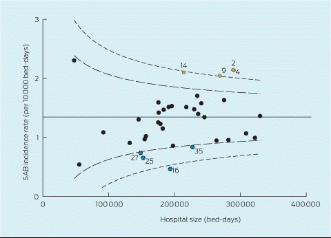
Each dot represents an individual hospital; brown dots signify a higher than expected rate, and blue dots a lower than expected rate. Each number indicates that hospital’s rank by SAB incidence in the previous year (2010–11). The horizontal solid line represents the mean rate of infections at all hospitals; the inner dashed lines represent the 95% confidence interval of the mean rate, and the outer dashed lines represent the 99.7% confidence interval.
Competing interests
No relevant disclosures.
References
- Dunlevy S, Gothe-Snape J. National Health Performance Authority reveals Australia’s worst hospitals for superbug Golden Staph infections. News.com.au 2013; 22 May. http://www.news.com.au/lifestyle/health-fitness/national-health-performance-authority-reveals-australias-worst-hospitals-for-superbug-golden-staph-infections/story-fneuzlbd-1226648738879 (accessed May 2013).
- Spiegelhalter DJ. Funnel plots for comparing institutional performance. Stat Med 2005; 24: 1185-1202. i1115617
- National Health Performance Authority. Hospital performance: healthcare-associated Staphylococcus aureus bloodstream infections in 2011–12, technical supplement. Sydney: NHPA, 2013. http://www.myhospitals.gov.au/publications/sab/latest/technical-supplement (accessed Nov 2013).
- Australian Institute of Health and Welfare. Australian hospital statistics 2011–12: Staphylococcus aureus bacteraemia in Australian public hospitals. Canberra: AIHW, 2013. (AIHW Cat. No. HSE 129.) http://www.aihw.gov.au/WorkArea/DownloadAsset.aspx?id=60129542613 (accessed Nov 2013).
- Francis R, Chair. Independent inquiry into care provided by Mid Staffordshire NHS Foundation Trust January 2005 – March 2009. London: The Stationery Office, 2010. i1115626
- Dr Foster Intelligence. Understanding HSMRs: a toolkit on hospital standardised mortality ratios. London: Dr Foster Intelligence, 2011. http://drfosterintelligence.co.uk/wp-content/uploads/2011/10/HSMR-Toolkit-Version-6-October-2011.pdf (accessed Nov 2013).
Provenance: Not commissioned; externally peer reviewed.
Costs of Delivering the Hep B PAST Model of Care in Remote Australia: A Retrospective Pre–Post Study
Hoa Nguyen, Anh Le Tuan Nguyen, Paula Binks, Melita McKinnon, Emily Vintour-Cesar, Karen Wills, Nicola Stephens, Benjamin Cowie, Joshua S. Davis, Yuejen Zhao, Peter Nihill, Julie A. Campbell, Andrew J. Palmer, Jane Davies, Barbara de Graaff
Buruli Ulcer Acquired From Ringtail Possum Rescue
Daniel P. O'Brien, Naomi Clarke, Sara Bonnici, Mohammad A. Hussain
Q Fever Visceral Abscesses After Contact With Native Australian Marsupials
Samantha J. Laws, Enzo Binotto, James Stewart, Jennifer Ho, Trent Yarwood, Josh Hanson, Simon Smith
Hospital-Admitted Injection-Related Infections Among Incarcerated People Who Inject Drugs in Australia: A Retrospective Cohort Study
Andrew Palmer, Matthew Carter, Jeremy Yeo, Cecilia Shim, Jason Connor, Jeremy Hayllar, Gerald Holtmann, Naomi Moy, Elliott G. Playford, Naomi Runnegar, Paul J. Clark
The Live Attenuated Influenza Vaccine in Australia: An Additional Tool for Influenza Prevention
Cyra Patel, Alexis Pillsbury, Tran Nguyen, Xia Wang, Helen E. Quinn, Clayton K. Chiu, Allen C. Cheng, Katie L. Flanagan, Zhicheng Wang
Reflex Testing for Hepatitis D Infection: A Unique Opportunity to Reduce Hepatitis D-Related Chronic Liver Disease Deaths in Australia
Jessica Howell, Lauren Andersson, Miriam T. Levy, James O'Beirne, Leon Adams, Katharine Irvine, Avik Majumdar, Golo Ahlenstiel, Kathy Jackson, Krispin Hajkowicz, Joseph Doyle, Jane Davies, Sarah Cherian, Wayne Dimech, Alexander J. Thompson